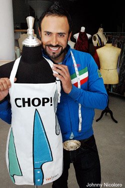
 I am very excited to "unveil" the brand-new "Nick Verreos Top Chef Apron". About a month ago, I was asked to design the "Top Chef" apron that would be sold on the Bravo website in conjunction with the debut of Season 2 of "Top Chef".
Initially, I was a bit confused in regards to what "designing" would entail. Was I going to add my infamous fishtails to the apron? Or could I somehow create a bias-cut apron with an asymmetrical hemline? No and No. Thank God. I then decided that I wanted the apron graphics to be fun, colorful and modern. I don't really cook--I order out and I microwave, that's how I cook, and I am embarrassed to say it. However, when designing the apron, I thought of what kind of apron I would wear, when microwavin'! I also thought of all those tacky old-school aprons that our moms would debut while serving the Thanksgiving turkey or that big plate of home-cooked paella. This apron would not be "your mom's old apron". I wanted to design a hip looking apron that you could see in a sexy editorial from a magazine like "Wallpaper".
From the beginning of my design, I always wanted the apron to somehow incorporate a large cutting knife, especially since that is already part of the "Top Chef" logo. At first, I wanted the apron to say "I'm going to CUT you!" , but then I decided that might be, how shall I say this, a bit too mean. So I went for "Chop!". I hope you guys like it and I think it will make a great gift for all those other microwave-cookers as well as real Chefs. Click HERE to read all about it on the Bravotv.com website.
I've moved my Blog!!! Click and bookmark the address below to join me NOW! And make sure to forward this to any of your friends who might be interested. http://www.uber.com/nickverreos